12 Laws of UX Every Product Professional Should Know
Proven practices and how to avoid common pitfalls
Welcome to the subscriber-only edition of The Product Compass!
Every Saturday, I share actionable tips and resources for PMs.
A few days ago, I published the second open PM Skills Assessment. Here, you can access the assessment and see the initial results:
And the first edition with the PM Competence Map:
Assessments and product challenges are a regular part of this newsletter. My goal is to help every subscriber become at least 30% better as a PM within 12 months.
Consider subscribing and upgrading your account if you haven’t already for the full experience:
12 Laws of UX Every Product Professional Should Know
This issue is based on the Laws of UX and Jon Yablonski's work, with my comments and examples adjusted to product teams.
While UX is a primary responsibility of the designer, UX knowledge and intuition are essential for PMs, too. Ultimately, your job is to “connect the dots.”
This post will quickly give you an overview of the most important topics.
Let's get into those techniques right now.
1. Aesthetic-Usability Effect
Users perceive designs that are aesthetically pleasing as more usable.
As a result, people might initially overlook minor issues if the design is appealing.
Product teams should recognize this effect, in particular when testing user prototypes. A/B prototype testing included.
The best approach is to focus on what users do, not just what they say.
2. Doherty Threshold
Productivity peaks when interactions between a computer and its users occur in less than 400 milliseconds.
Product teams should aim for system feedback within 400ms to maintain user engagement.
It's not just about actual speed. You can enhance the perceived speed of your product with techniques like animations or progress indicators.
For example, try to search for posts on LinkedIn. LinkedIn quickly displays an empty skeleton with animations before getting any response from the server:
3. Law of Common Region
Elements sharing a defined boundary are seen as part of the same group.
Creating clear structures through common regions helps users quickly understand the relationship between different elements and sections.
Simple methods like adding borders can effectively group elements. This enhances visual clarity and improves the overall user experience.
4. Von Restorff Effect
In a group of similar items, the one that stands out is most remembered.
For product teams, this means highlighting critical information or actions. Ensure they stand out, but be careful to prevent visual clutter.
A common approach is highlighting only one “primary action” the user is encouraged to take:
Another example is the Asana pricing page, with a clear indication that the user should select the “Starter” plan:
5. Goal-Gradient Effect
Users’ motivation increases as they get closer to completing a task
You can encourage users by showing them how close to the end they are with the help of progress bars or checklists.
You can also consider:
Presenting an illusion of progress, such as starting from 20%.
Moving the bar regardless of whether the progress can be determined.
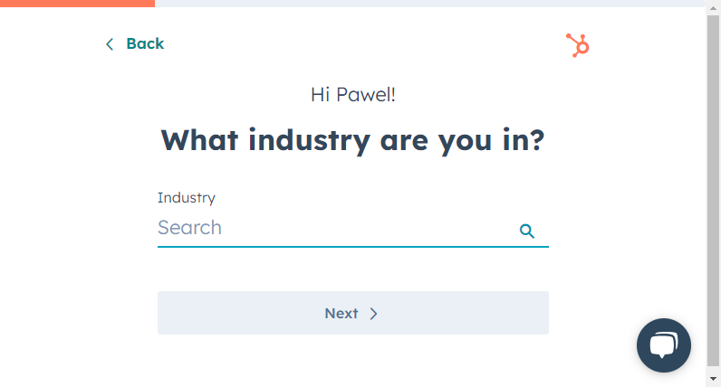
This can increase user motivation to complete a task. For example, HubSpot presents significant progress in the first step of an account creation flow:
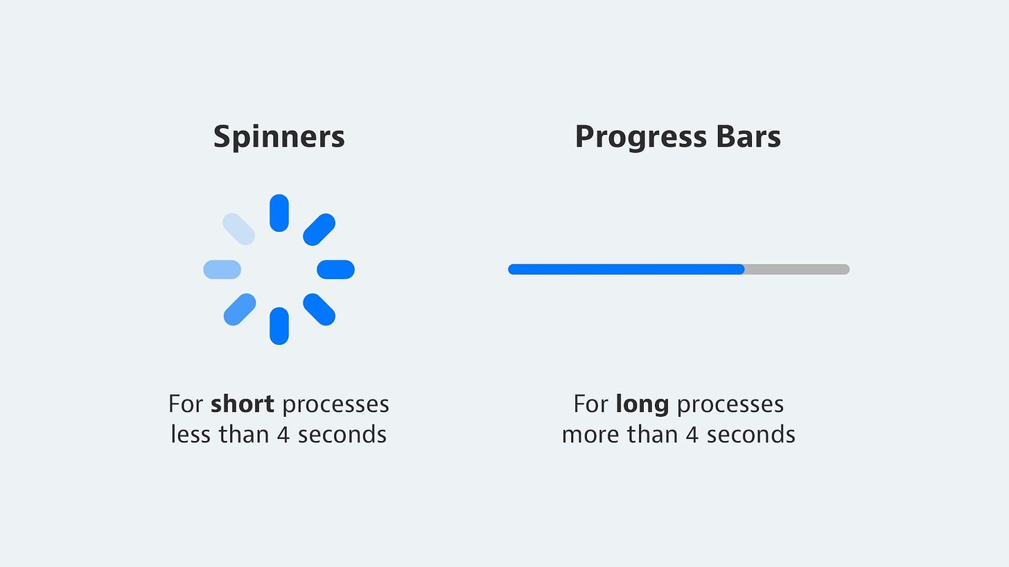
An important conclusion is not using spinners for processes longer than 4 seconds, as they do not indicate the progress:
6. Hick’s Law
The time it takes to make a decision increases with the number and complexity of choices.
More choices can slow down decision-making. For product teams, simplifying available options is critical:
Reduce options when quick decisions matter.
Break down complex tasks into smaller, manageable steps.
Here’s how less common document types are hidden in Google Drive:
Keep reading with a 7-day free trial
Subscribe to The Product Compass to keep reading this post and get 7 days of free access to the full post archives.


